


Google Translation to English
(I apologize for weird grammar or bad syntax. It's Google's fault
and I don't have time to check and correct)
and I don't have time to check and correct)
INTENSE DIALOGUE WITH THE CREATOR OF THE COVER OF THE ALBUM
CLAUDIO BERGAMIN"I Designed a lethal cybernetic creature"
From Chile to the world. Claudio Bergamin is the artist chosen by Judas Priest to design the cover of their brand new album, "Firepower". We contacted him to learn a little more about his work and to give us details of how the cover of the launch of the year was made within the heavy metal scene. His relationship with Richie Faulkner, Walter Giardino and many bands of the scene. An intense dialogue with someone who does not stop growing and who will surely continue to surprise us in the future.
From Chile to the world. Claudio Bergamin is the artist chosen by Judas Priest to design the cover of their brand new album, "Firepower". We contacted him to learn a little more about his work and to give us details of how the cover of the launch of the year was made within the heavy metal scene. His relationship with Richie Faulkner, Walter Giardino and many bands of the scene. An intense dialogue with someone who does not stop growing and who will surely continue to surprise us in the future.
1) Tell us how you interacted with Judas Priest and how it was that they finally commissioned you the design of the cover.
Well, I have already collaborated for several years with Richie Faulkner in different projects related to Priest. Initially
he asked me for help with his guitars since at that time he was just
developing his custom models, so I created several guitar designs based
on Gibson models. Then I designed his Falcon logo, which he uses in his wardrobe and guitars. Additionally
I have designed all his Star Wars guitar picks and recently
promotional images that will soon be published on his website. And as a trivia piece, this is not the first time I got involved in a Priest album; About four years ago I proposed ideas for what would be Redeemer of Souls. Those ideas stayed in the inkwell. This time Firepower arrived at the right time.
2) Was the drawing your idea or did you follow the guidelines that the band gave you?
The band gave me absolute creative freedom and they were open to a fresh proposal from the beginning. Initially
they only gave me the title to start working, but being a big fan of
the band, I knew exactly what I wanted to see on a cover of Judas
Priest. I
wanted to see a creature that retakes the tradition of the characters
of the classic covers, Hellion in "Screaming for Vengenance", Metallian
in "Defenders of the Faith and of course The Painkiller. Now, I did not want to copy the cover style of Doug Johnson, he has his style and I have mine; I simply wanted to play on the same theme and wave to establish that they belong to the same metallic fantasy universe. Another
thing that was clear to me is that it could not look old: Priest is a
band that although it is an emblem of classic metal, at the same time
they are in constant re-invention. In other words, they play in a fine line between the classic and the contemporary; understanding this was essential to propose ideas that they would accept and appreciate quickly. We were tuned from the beginning!
3) With whom did you exchange ideas, with musicians directly or via manager?
The collaboration was with management and band, especially Richie Faulkner, who was of a tremendous conceptual contribution. He was the one who suggested a lethal cybernetic creature. Richie and I have the same tastes in pop culture; we
speak the same nerd language and we are both staunch fans of Star Wars,
so it will not be hard for you to imagine how fluid the creation of
Firepower was. In any case, Judas Priest is a monument to efficiency and professionalism, it was a delight to work on that project. Rob
Halford gave the creature such an epic name, it will make every neuron
in your mind heavy metal explode at the speed of light! But to discover it, you must wait to have the disk in your hands.
4) How did you do the drawing, with what techniques? What meaning did you give to it? Did you listen to songs on the album to inspire you?
The first step was to propose three quick conceptual sketches, all variations of the same idea, of which they chose one. Then, I translated that sketch to a much more refined version, always pencil on paper. Subsequently, that detailed drawing I put in the scanner and then applied digital color. Originally I wanted to do it in acrylic on canvas, but the time restrictions did not allow it. Now that there is no hurry, I can work on that painting on canvas, just for personal fun. It will be ready in a couple of months - I heard some issues while I was working on the cover, it was certainly inspiring!
5) What was the repercussion that you had from the public and the press?
Tremendously positive! Everyone understood the intention and concept. On the other hand, if someone does not like it, they do not understand anything about Priest's thematic tradition!
6) Tell us any anecdote that has happened in the drawing process.
Every person who visited our house begged on his knees to see the image before it was published. It became a kind of Holy Shroud, everyone wanted to see it.
7) How did you get started in the drawing and how did you get related to rock bands?
My interest in art began at an early age. My
introduction to the world of graphic arts and pop culture was
undoubtedly Star Wars and the anime that reigned TV in the early 80s. Titles
like Mazinger Z and the Robot Festival were of great creative influence
in my artistic awakening, in fact I still have many drawings of my
childhood in folders and boxes stored in some ancient corner of my
house. Simultaneously, I always had access to a wide range of comic titles; Asterix
was undoubtedly one of my favorites and of course, Spider-Man, Batman
and Superman were always present in those incipient years. In
other words, there was never a decisive moment in which I decided to
dedicate myself to art, but it was a natural process that developed over
many years. My parents put pencil and paper at my fingertips before I even spoke, and since childhood it was really a spontaneous interest; while other children played ball, I drew. After school, entering art school to pursue the profession more seriously was a logical step.After graduating from college, I put my attention on something I had always dreamed of; cover art and advertising photography. It was a period of great creativity and fun. I
spent the weekdays in my workshop exploring new techniques, whether
analogue or digital, and weekends at concerts by local bands. It
was at that time that I published my first website, which attracted the
attention of some relevant Chilean bands of the moment such as Criminal
and Dogma. They
were my first clients at the beginning of the year 2000. After that I
went to live in Europe and my customer portfolio increased
exponentially; I get to work with almost all the relevant metal stamps in Germany, Sweden and the rest of the Nordic countries
8) With which bands have you worked before Judas Priest?
While
living in Italy and England I made many contacts in labels like Century
Media, AFM Records and Nuclear Blast, which gave me the opportunity to
work with many relevant bands from that continent and England. Paradox, from Germany, are clients with whom I have been collaborating for more than ten years. Then
I worked on the album "Lost in the New Real", by prominent Dutch
musician Arjen Lucassen (the brilliant creative mind behind Ayreon); That was a very interesting project. Not
long after that, high profile clients like Accept, Rob Halford and Rata
Blanca arrived, with whom I maintain a professional collaboration until
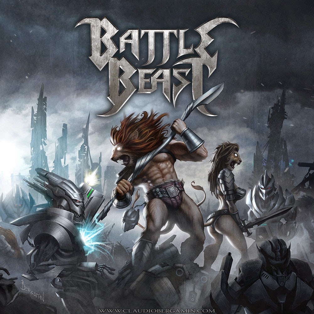
today. In 2013 I started working with one of the most outstanding bands in Finland; Battle Beast, for which I made two covers. But at the same time I have always maintained a link with the rock and metal scene of Chile; Lucybell, ChernoBill and recently Iron Spell are some of the names for which I have created art that has left me very satisfied.
9) Apart from rock and metal, in which another item you venture with your drawings and paintings?
I have always been an amateur of paranormal phenomena. For
many years I have studied cryptozoology and ufology, devouring tons of
books and documentaries of the most outstanding researchers. But it was not until the middle of 2016 that I decided to start exploring those subjects artistically. I
made a series of illustrations inspired by Bigfoot and Yeti, which
attracted the attention of researchers such as Lyle Blackburn and Loren
Coleman, who hired me to create their book covers. Parallel to that I began to collaborate with legendary personalities of the paranormal world; one
of them, is the famous Travis Walton, with whom I work to completely
re-illustrate his book Fire in the Sky, which deals with his experience
of extraterrestrial abduction in 1975 (I recommend watching the film
Fire in the Sky, 1993). Another
name that stands out is Bob Gimilin, for which I made a dramatic
recreation of his encounter with a Bigfoot female in 1967 with his
friend Roger Patterson. I
am currently working on a series of personal illustrations inspired by
the most relevant ufology and cryptozoology events of the 20th century,
which will be released in 2018.
10) What were the artists that influenced you in the beginning?
My father, who was an architect, introduced me to the art of M.C. Escher, René Magritte and Salvador Dalí when he was a pre-adolescent. That was really an upgrade that reprogrammed me the look, since until then all my world was fantasy and comics of super-heroes. By
introducing me to the world of classical art, my father gave me the
tools to discover on my own the magnificent work of essential artists of
the second half of the 20th century. Of
that group, Ralph McQuarrie was probably the artist who determined the
moment culminated in my attention to the graphic arts took a more
serious turn. Frank
Frazetta and Boris Vallejo were my introduction to the world of heroic
fantasy, style and genre that is present in my personal work to this
day. HR Giger went to a certain point a true revelation; His style and theme was something so strange and original that it really transported me to another world. I remember spending hours devouring and processing his Taschen books. At
the same time, my interest in rock music exploded at the speed of
light, and with it came a fascination for visual proposals and cover
art. Without
a doubt the name that stands out in that world is Derek Riggs, artist
of great influence in my artistic career, and person with whom today it
is very surreal to say that I have grown to cultivate a friendship and
great professional respect. Finally, other artists that deserve mention in my training are: Dave
McKean, Neal Adams, Brian Bolland, Ken Kelly, John Howe, Storm
Thorgerson, Harold Foster, Bruce Timm, Drew Struzan, Caravaggio, El
Bosco and the great Bernie Wrightson.
11) Talking about Rata Blanca, how did you get the contact so that you could finally make the cover drawing of "Electric Storm", your last album?
I met Walter in a very strange way. Someone asked my friend Michael Kenney of Iron Maiden if he knew any cover artist. Mike suggested my name and that person in turn gave my name to Gaby Sisti, who put me in touch with Walter. It was like the game five degrees of separation with Kevin Bacon (laughs). -
I have the impression, that initially Walter was not very sure if
someone could translate what he had in mind at that time, that it was an
improved and updated version of the first cover of Rata Blanca, which
would be used to commemorate the 25th anniversary from the band. It took us a few days to get in tune and understand the modus operandi of one and the other. I
proposed several elaborate sketches and finally Walter chose the
simplest, which was basically Rat's castle in glory and majesty. Today
I think it is not an exaggeration to say that this castle has been the
most publicized image in the history of Rata Blanca. And that was our first collaboration five years ago. Electric Storm was simply the logical step and an illustration of
which I am very proud, not only for its artistic value, but also because
it contains a portrait of my dear friend Guillermo Sanchez, which I
miss a lot.
12) How is your relationship with Walter Giardino? How do you feel working with him?
My artistic collaboration with Walter has always been extremely gratifying. In
addition, I have always had a predilection for classic fantasy
therefore the subject of Rata Blanca is something that I enjoy a lot. We usually discuss the work to be done over the phone, in long conversations that do not always refer to work; We often end up talking about music and our favorite classic bands. Because Walter is like that, a real guy who loves rock.
13) Apart from Rata Blanca, Walter commissioned you to make the poster of Temple, What specifically asked you for that flyer?
That poster required a lot of experimentation and time since Walter had a very intuitive idea of what he wanted. Sometimes
the words do not accurately express the aesthetic minutiae of art and
Walter had his eye on styles like Art Nouveau and Pop Art. Styles that
do not usually go together. Finally we arrived at the solution that I was looking for and the
result is certainly a very experimental poster that does not go
unnoticed.
14) Is there any intention to continue working with Temple in the future?
Probably yes. Walter is Temple and Temple is Walter.
15) What is coming in this 2018? Are you doing some work for a band?
This 2018 I intend to dedicate myself fully to work in my projects of Ufology and Cryptozoology. But at the moment I'm working on four illustrations for bands from Finland, Sweden and England. I do not have time even to listen to my thoughts.
16) What music do you listen to and what are your favorite bands?
I listen to a lot of classic rock, it's my main preference style. Queen,
KISS, Iron Maiden, Judas Priest, Rush, Rainbow, Motley Crue, Alice
Cooper, Van Halen, Black Sabbath, Accept, Whitesnake, Heart, ELO,
Scorpions, Metallica, Mercyful Fate and of course White Rat are some of
my bands favorites But
I also listen to a lot of orchestral music, whether classical or
contemporary, especially while I work: Tchaikovsky, Bach, Wagner and
Beethoven are my favorite classical composers. And
in the contemporary, I listen to many soundtracks for films by
composers like John Williams, Jerry Goldsmith, Alan Silvestri, James
Horner, Basil Poledouris, Danny Elfman and Hans Zimmer. If I can cite a real source of inspiration for my illustrations, it would be precisely this; orchestral music of enormous melodic grandeur that transports me to fantastic cosmic voyages of imagination.
17) How can they contact you to commission work?
It's very easy: info@claudiobergamin.com
And my websites: www.claudiobergamin.com and www.facebook.com/claudiobergamin.art
And my websites: www.claudiobergamin.com and www.facebook.com/claudiobergamin.art